Bh Cosmetics
Website Redesign
I redesigned the BH Cosmetics website with a mobile-first, user-friendly, and modern layout, using bright colors, bold imagery, and interactive elements to align with the brand and boost engagement. I simplified the brand identity and optimized the checkout process to ensure a smooth mobile shopping experience.
Homepage Analysis
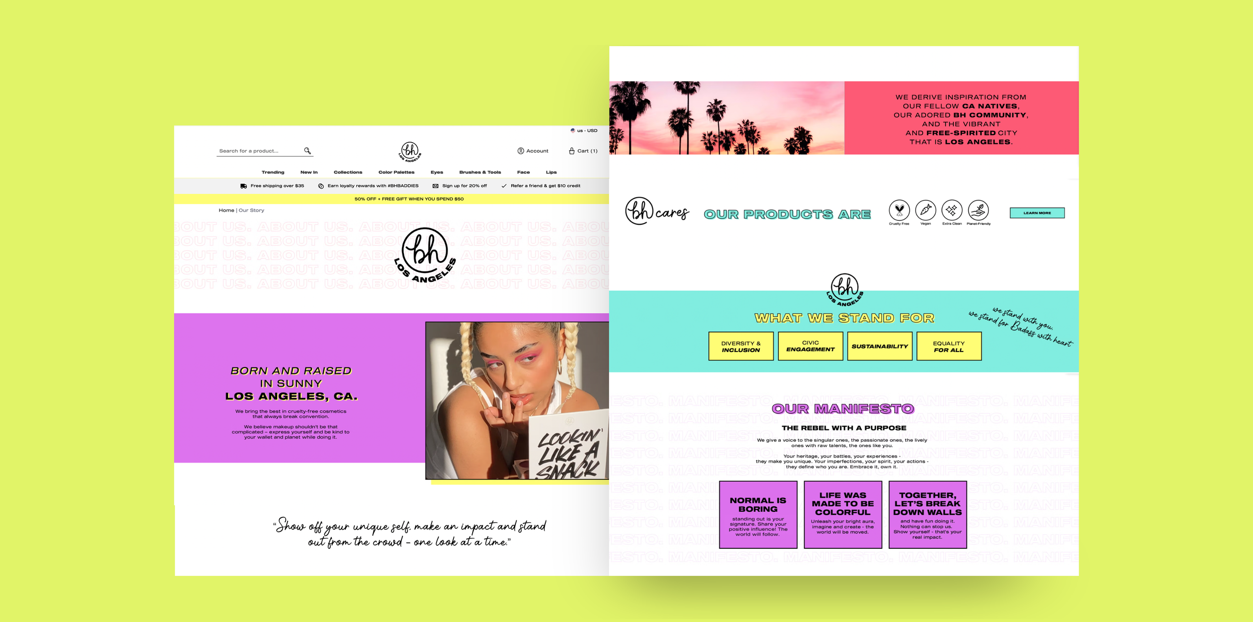
Drop-down menus, rollover images, and animated GIFs create usability and accessibility challenges, especially for mobile users and individuals with disabilities.
Disjointed navigation and slow page load times hinder the overall experience.
Excessive images with text pose SEO challenges.
Inconsistent fonts and images across different screen sizes compromise user experience.
Lacks cohesive branding and clear page hierarchy.
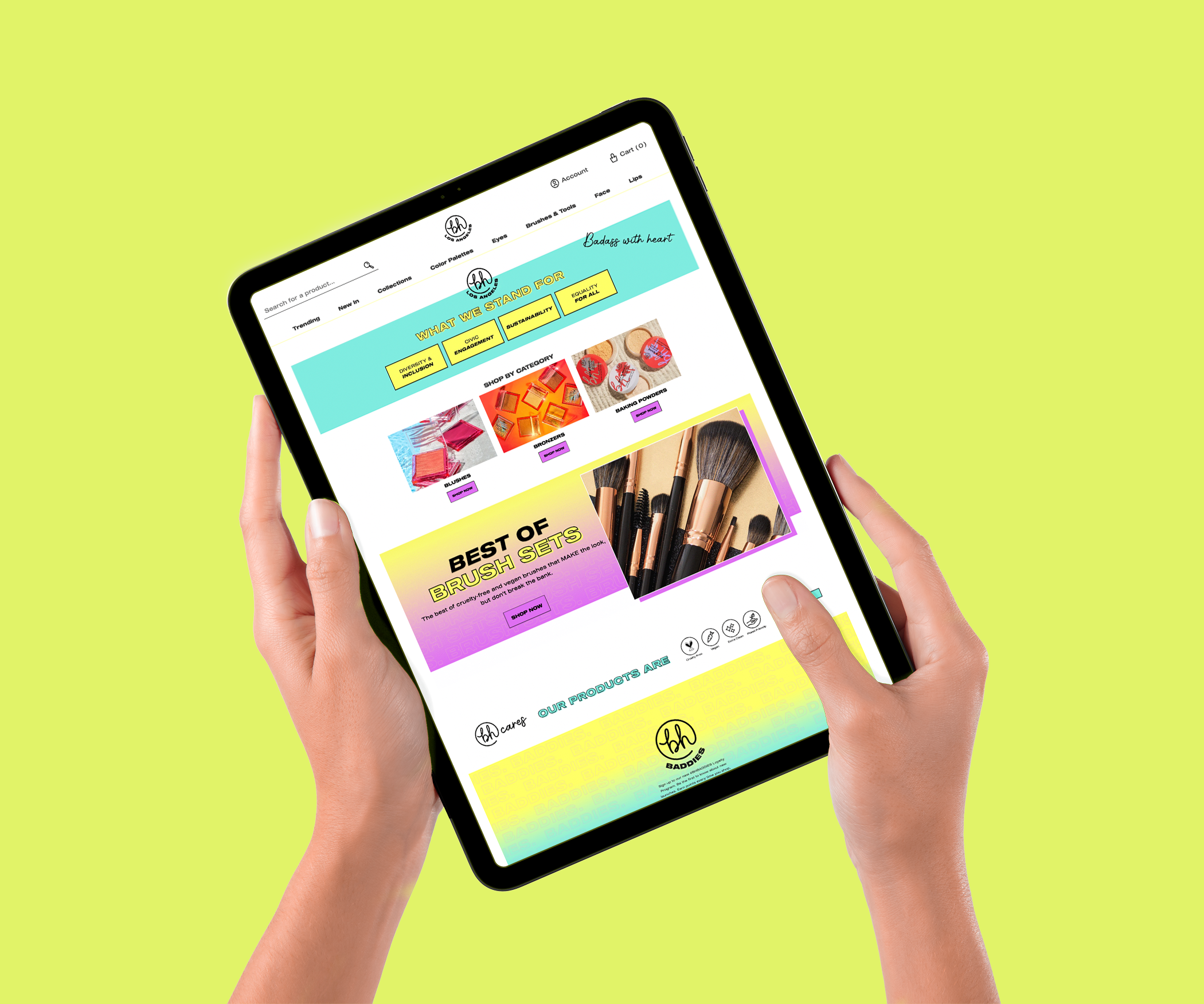
THE ORIGINAL SITE DESIGN


Responsive Design
The non-responsive, image-heavy website appears outdated compared to competitors' sites that prioritize mobile responsiveness and user-friendly design.
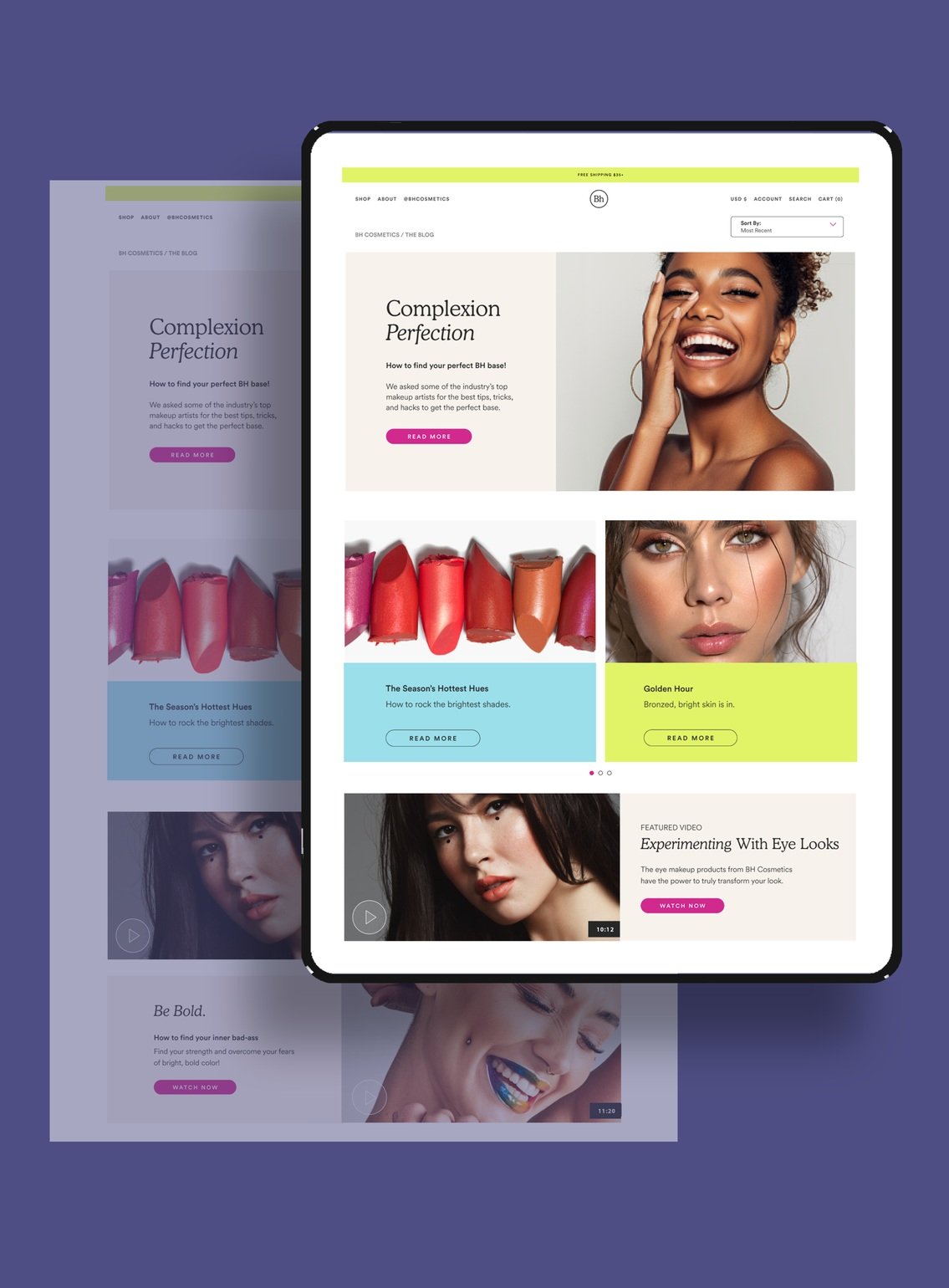
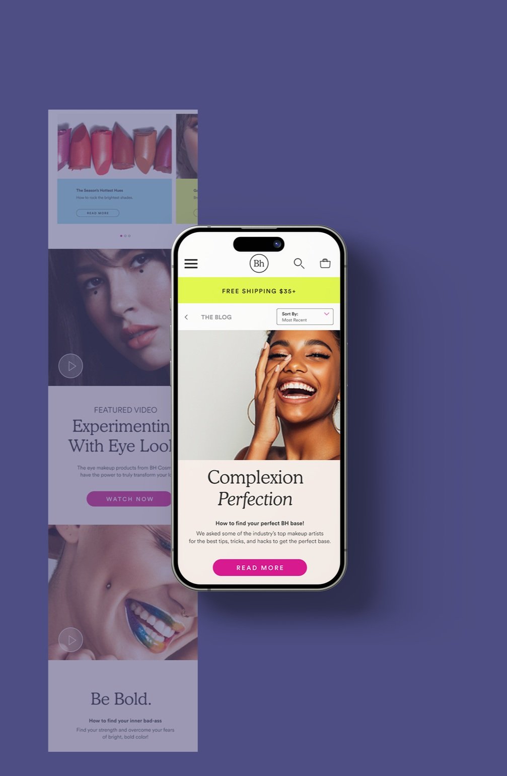
Homepage Revisions
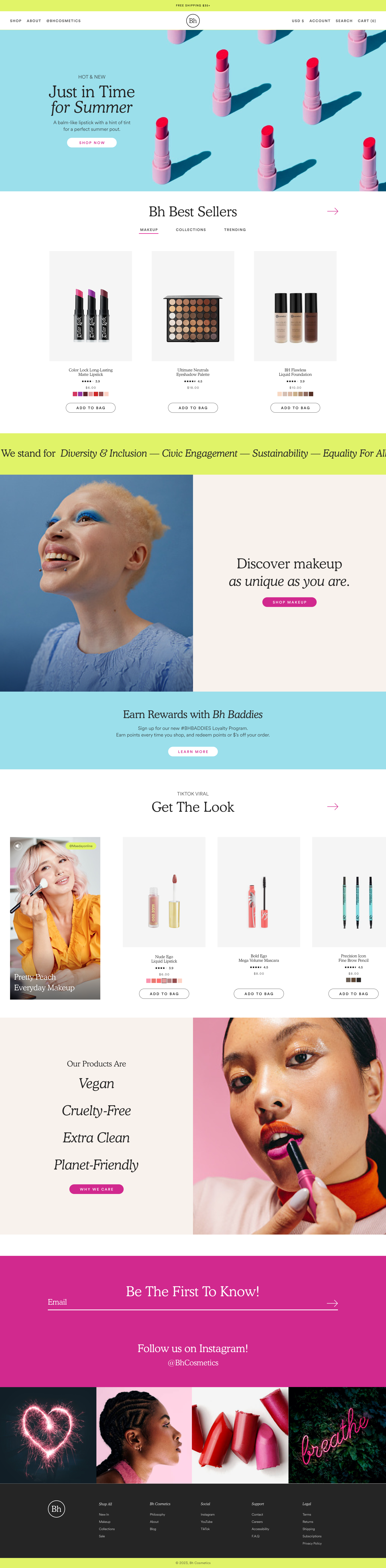
I used bright colors and fun imagery from the original site while modernizing the UX to prioritize clarity, performance, and the mobile experience.
Added a promo bar that cycles through messaging
Intentionally used ADA-compliant colors
Added a simplified drop-down navigation menu
Designed a beautiful, eye-catching hero image
Updated to clean, modern branding with limited pops of color.
THE REVISED SITE DESIGN

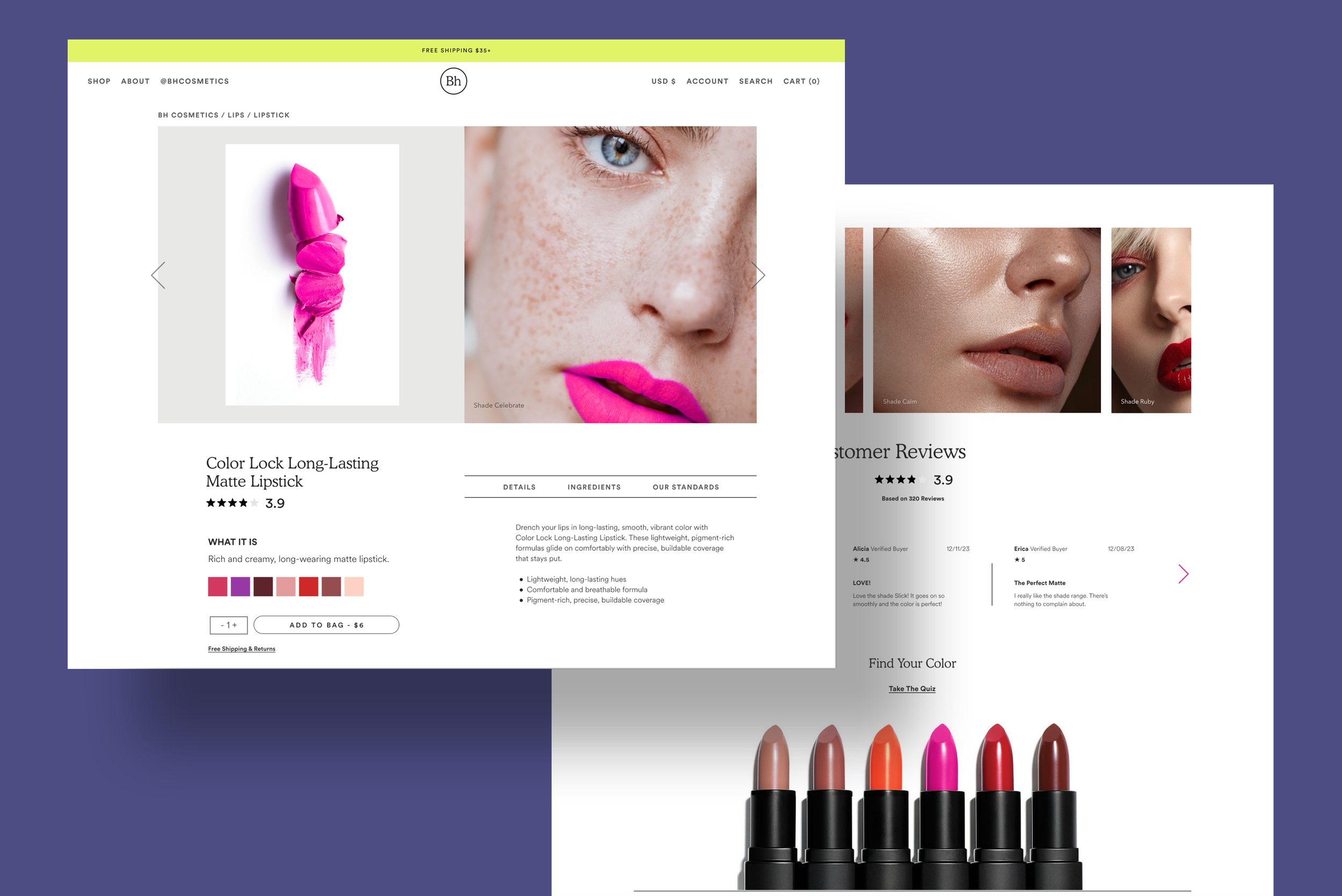
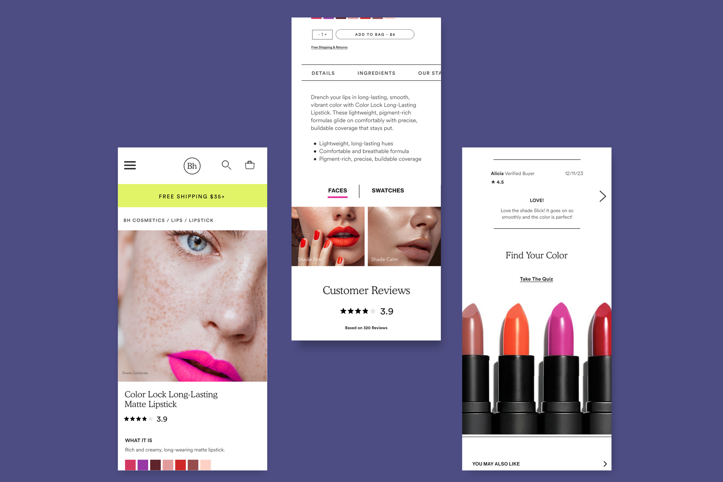
PRODUCT DESCRIPTION PAGE
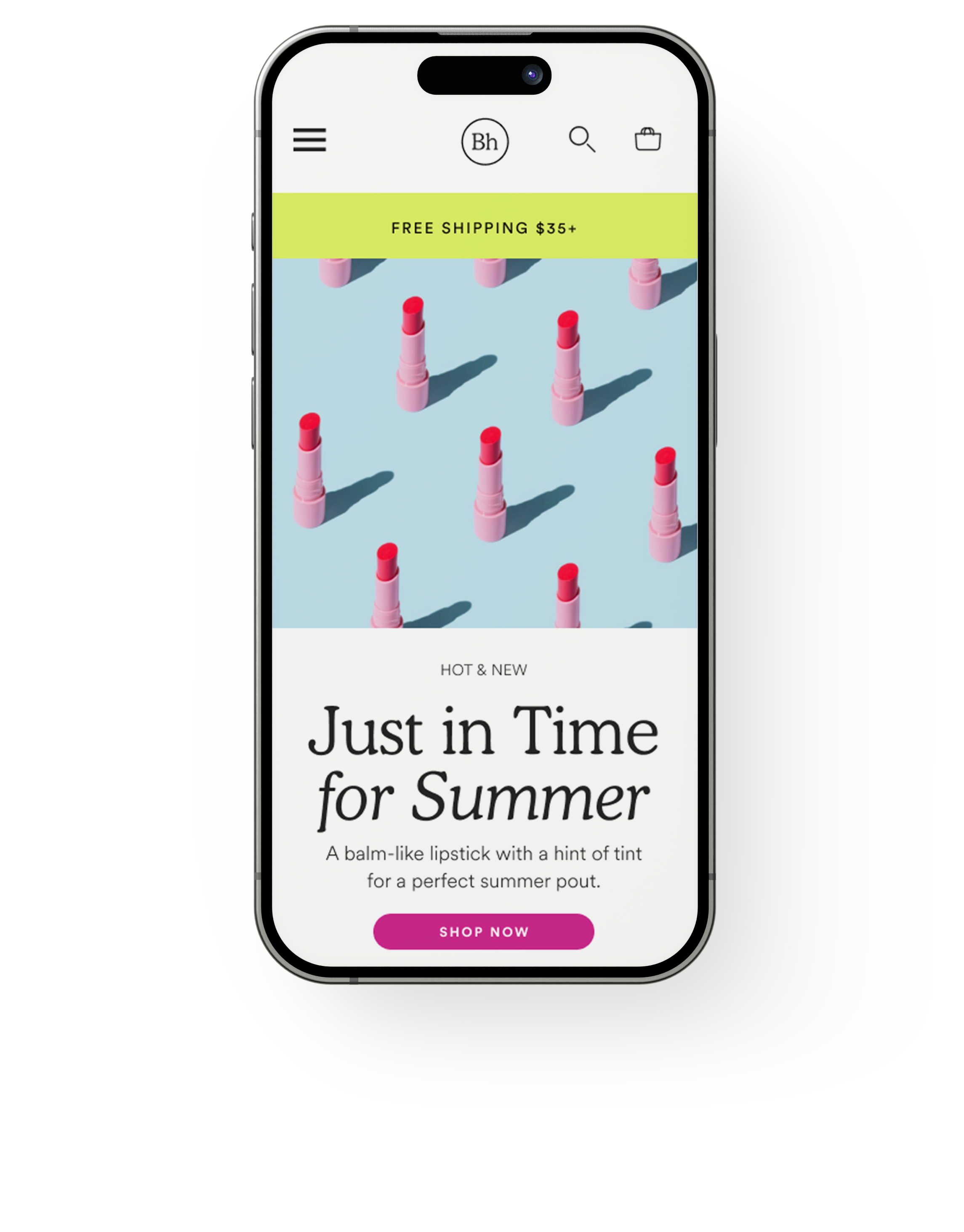
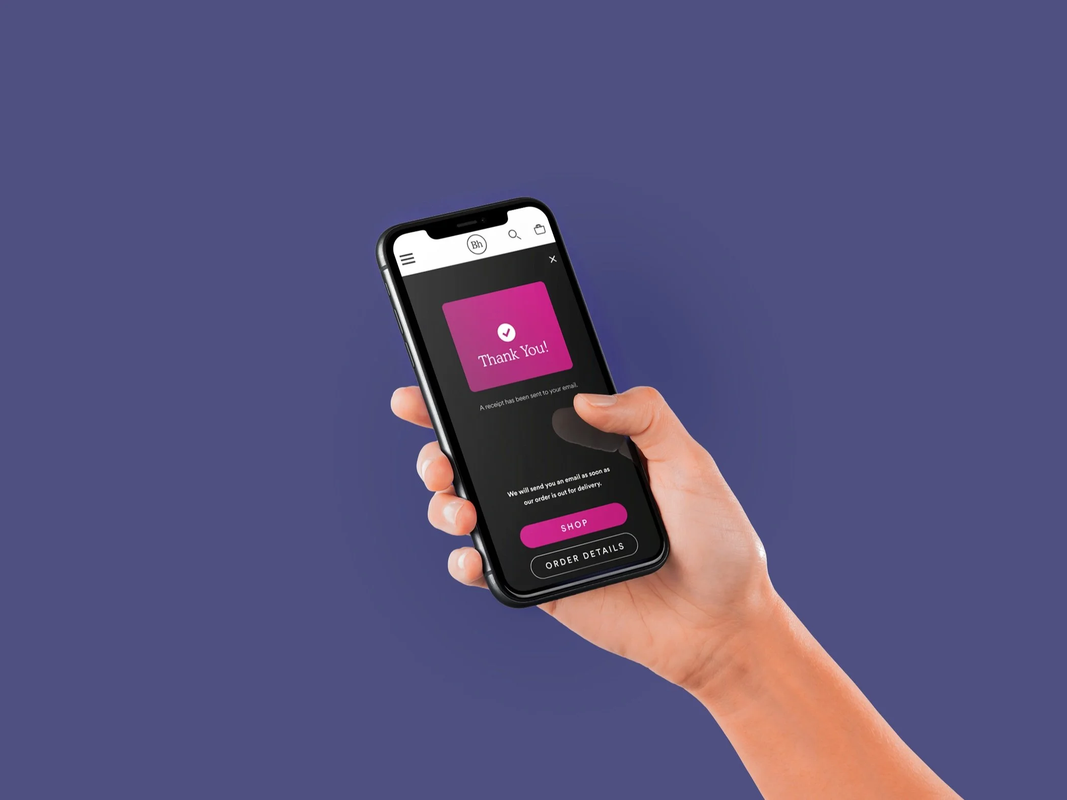
MOBILE-FRIENDLY CHECK-OUT EXPERIENCE

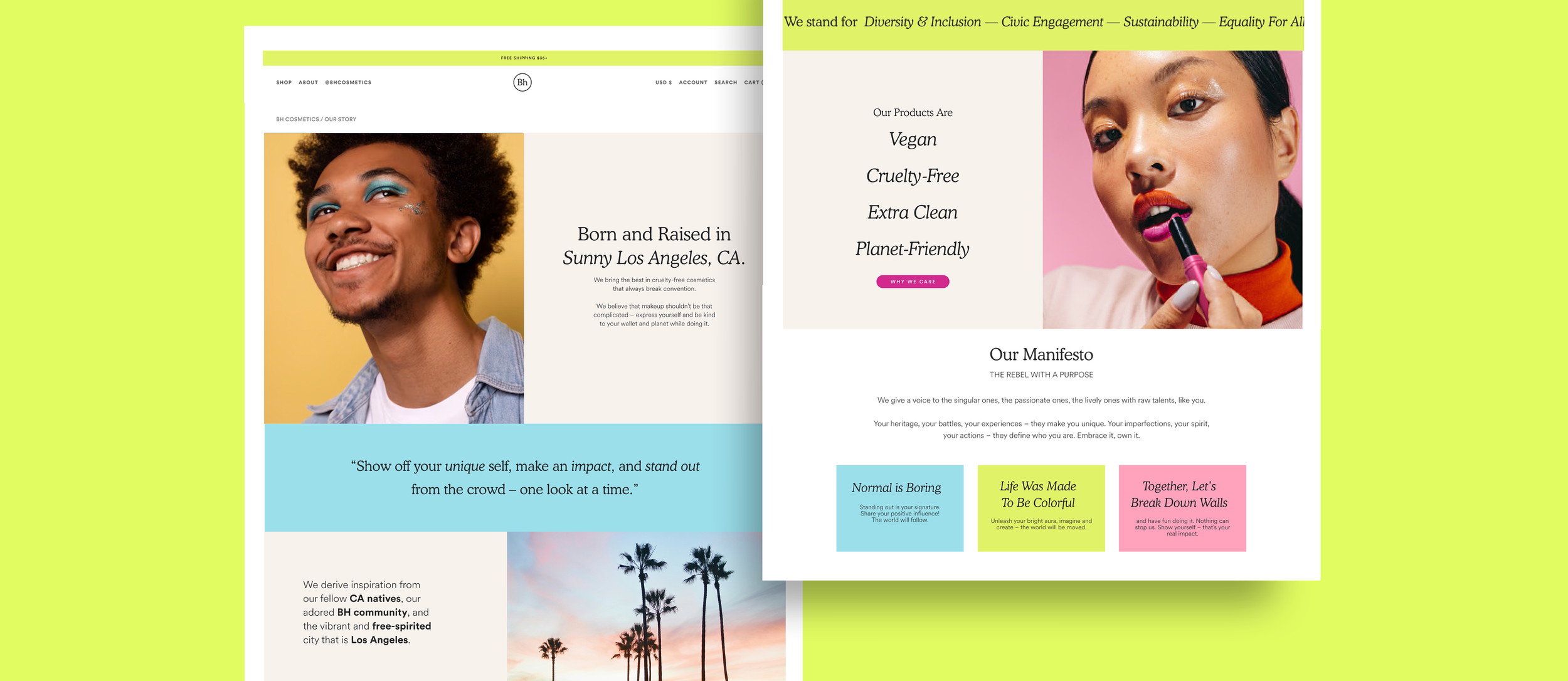
UPDATED “OUR STORY” PAGE
INTERACTIVE MAKEUP QUIZ
BLOG PAGE